😍 My friend's getting married!
😟 Her husband-to-be comes with two cats, and she's not exactly a cat person.
I set out to design a product that would make the process of getting a new pet less stressful… but my research pushed me in another direction.
The result: A community for pet owners to share and read unbiased pet product reviews.
PROJECT SUMMARY
Inspired by a challenge a friend encountered, I set out to make the process of introducing a new pet into one’s home less stressful.
My research revealed that people are overwhelmed by the amount of pet information available online, making it difficult to identify reliable sources.
After considering possible solutions, I narrowed my focus to one question: How might we make it easier for people to decide which pet products to buy?
I then designed and tested an app with the goal of providing a trusted space for pet owners to read and share product reviews.
TIMELINE & SCOPE
Since this was a solo project, I was able to follow the “happy path” and complete all the desired steps in the process.
SECONDARY RESEARCH
I began by conducting desk research to learn about the types of concerns that people have about pets and pet ownership, and 2 things bubbled to the surface.
1
Many people who own or are considering getting a pet experience anxiety about the decisions they need to make.
2
Online pet advice conflicts, and financial incentives can bias recommendations
For example, a website gets a kickback if you buy through a link on their site.
USER INTERVIEWS
With the knowledge from my secondary research, I conducted 7 semi-structured user interviews with current and former pet owners.

I refined my discussion guide through a pilot interview but initially struggled to gather useful insights, despite knowing the interviewee’s past pet health experiences. A breakthrough came with the question: “Have you ever taken a pet to the vet for anything other than a routine visit?”

I learned an interesting story about how people conduct research. One interviewee, after being offered a refund for leaving a 5-star review on a poor-quality pet product, now only trusts 3- and 4-star reviews, viewing 5-star reviews as biased and low-star reviews as overly negative.

Several participants mentioned being cautious about who they trust for advice. One interviewee, after researching a particular dog breed and encountering conflicting opinions, now considers a person’s follower count as a measure of reliability.
THEMATIC ANALYSIS
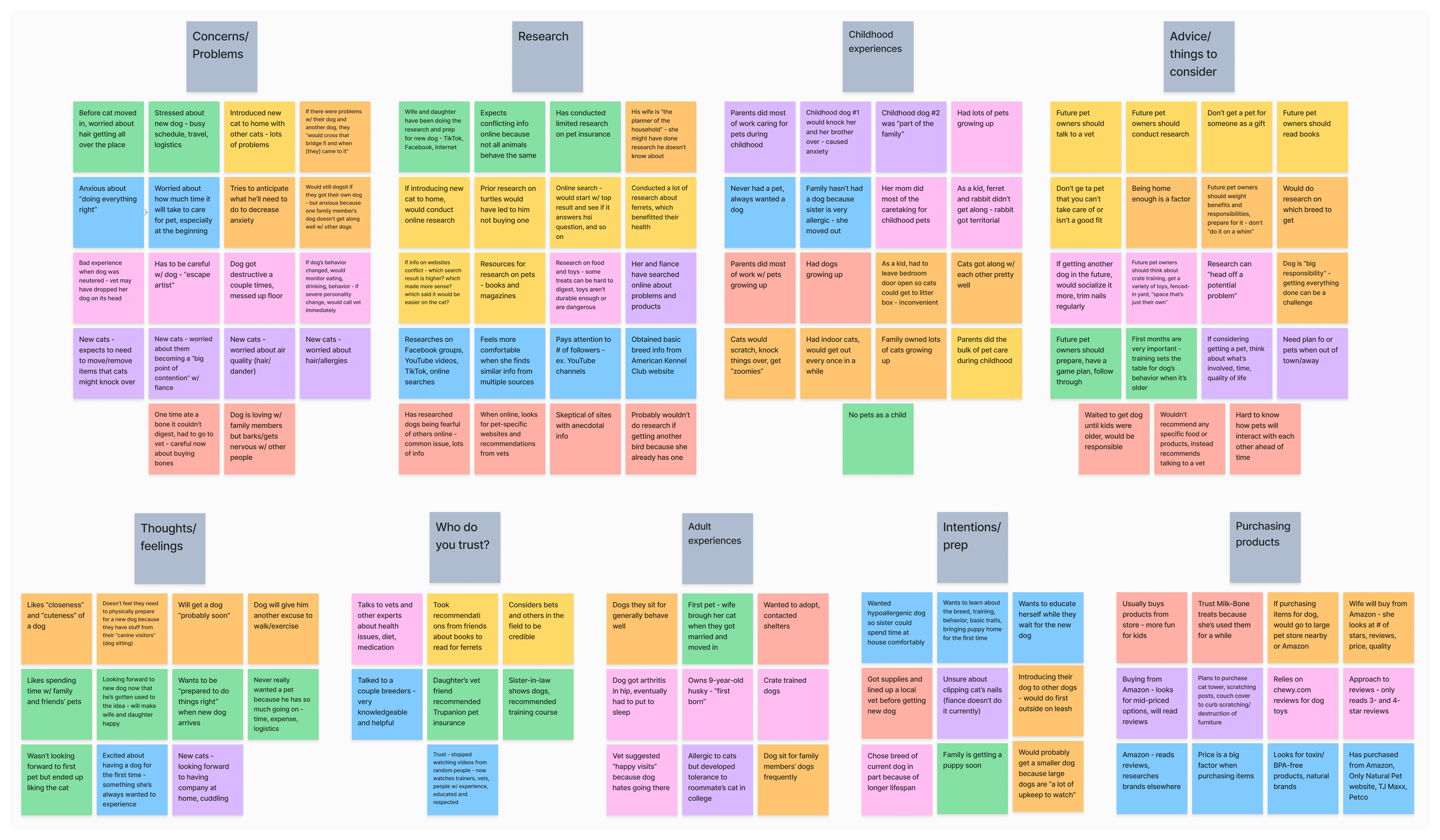
I created an affinity diagram to identify the major themes from my user interviews. As I found in my secondary research, anxiety and issues of trust were common.
Click on the affinity diagram to open a FigJam file in a new tab.
PERSONA DEVELOPMENT
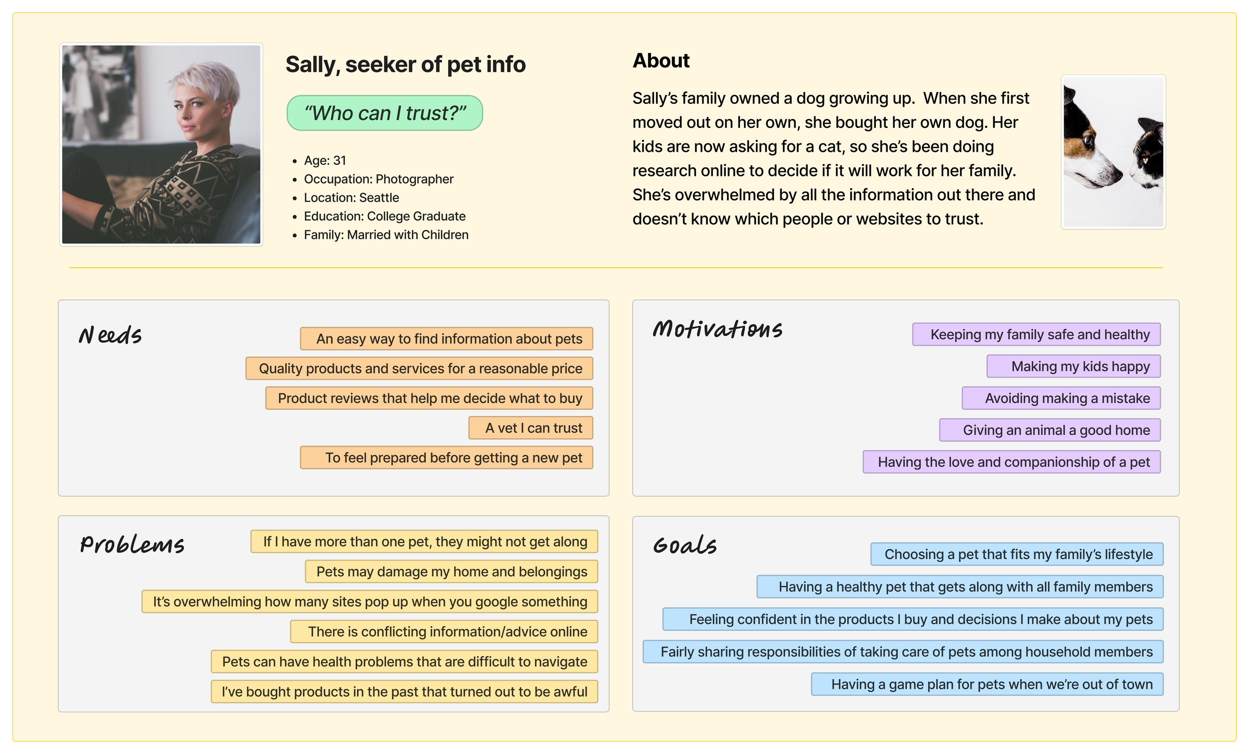
I used my findings from both secondary research and user interviews to develop a persona.
My solution would need to address a target user who:
Has a desire for information about pets.
Wants to make good decisions.
Is overwhelmed by the amount of advice and recommendations available online.
May have a hard time determining credibility and motives.
Click on the persona to open a FigJam file in a new tab.
IDEATION
Through a series of solo brainstorming activities, I generated several potential solutions. However, all but one would be difficult to implement without introducing the potential for bias.

I ultimately decided to design an app that allows users to search for and review pet products.
The app wouldn't sell anything or link to retailer sites, removing financial incentives for misleading information.
Revenue would come from a small download or membership fee, and operating costs would be low.
The search could be more advanced than general engines or retail sites, allowing users to save pet details for more efficient and tailored results.
Before I moved on to sketching a solution, I conducted a heuristic analysis of three websites that offer reviews of pet products but don’t sell anything. Read the heuristic analysis in a new tab.
SKETCHES
A minimum viable product had to include product search and product reviews, so I sketched screens for those red route user flows.
Click on the sketches to enlarge.
GUERILLA USABILITY TESTING
I converted the sketches into a clickable prototype and conducted guerilla usability testing with 5 participants.
Key Observations → Resulting Adjustments
Lack of clarity with labels, especially drop-down menus. → Need to clearly indicate the purpose of each element and what is required vs. optional when searching.
Icons to review a product or copy product info to clipboard were overlooked. → Make them bigger/more noticeable.
Uncertainty if product reviews were submitted successfully. → Add a screen that confirms submission and thanks the user for writing the review.
WIREFRAMES & WIREFLOWS
I applied my findings from guerilla usability testing and created wireflows to map out how a user would move through the app to accomplish the 2 main goals, searching for a product and reviewing a product.
Red route 1: Search for a product
Click on the wireflow to enlarge.
Red route 2: Review a product
Click on the wireflow to enlarge.
HIGH-FIDELITY PROTOTYPE
I created a high-fidelity prototype in Figma with a streamlined UI design to match the simple flow of the product.
Click on the prototype to open an interactive view in a new tab.
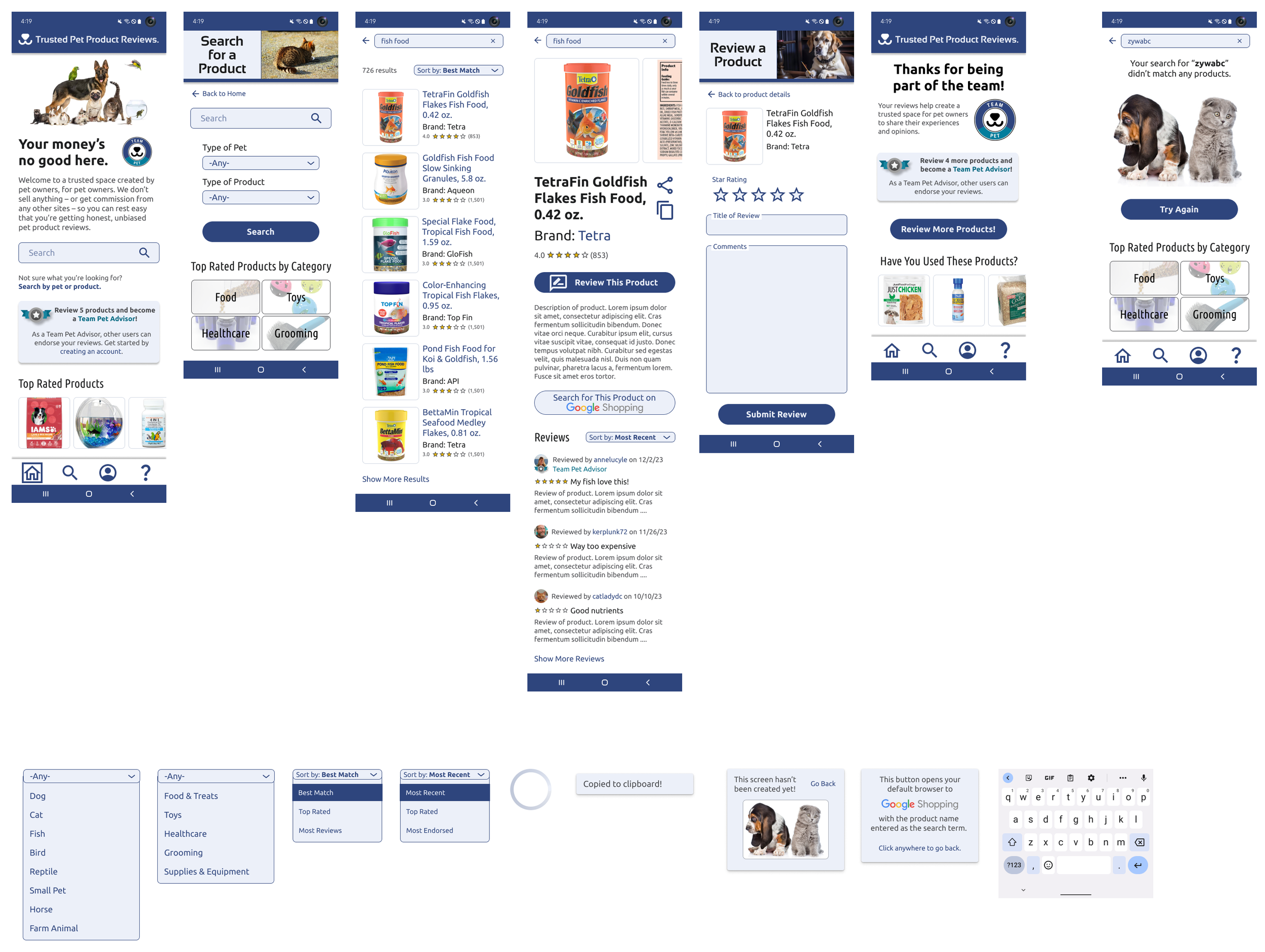
USABILITY TESTING
I conducted 2 rounds of usability testing, iterating on my designs after both rounds.
5
in-person moderated sessions
4
remote moderated sessions
1
unmoderated session
ITERATION: WHAT & WHY
Based on the findings from usability testing, I made improvements to my design.
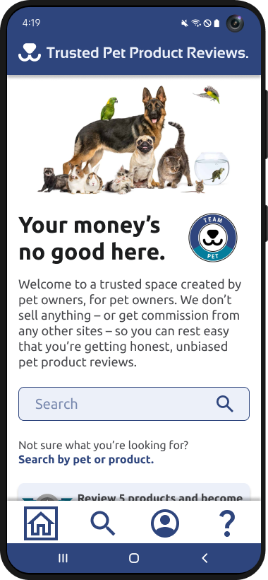
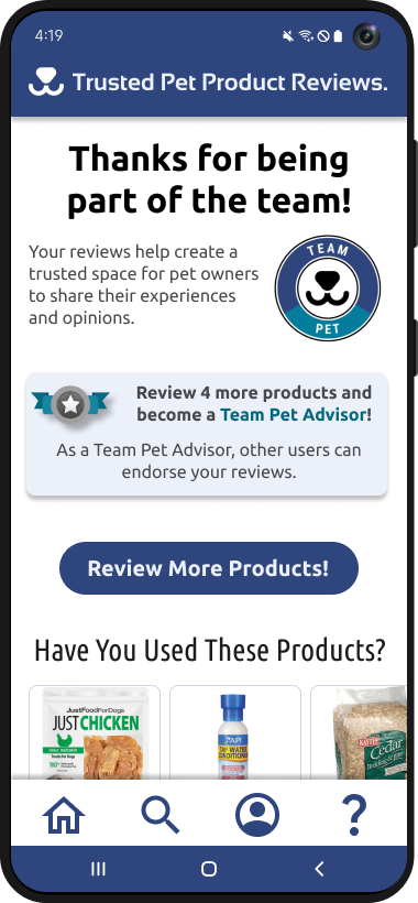
1 Some test participants misinterpreted "Join the team" as implying employment. I replaced it with "Your money’s no good here" to spark curiosity and encourage them to read the following paragraph.
2 The original paragraph didn’t clearly convey the app’s unique advantage over other product review sources. The revised version highlights the value proposition more explicitly.
3 During testing, participants suggested incentives like coupons or raffles to encourage reviews. To align with the app's mission, I introduced a non-monetary reward: "Team Pet Advisor" status, earned after reviewing five products.
4 Three test participants used the search flow to start reviewing, while one struggled to access product details from the review flow. I merged the flows, making the review option an extension of the search flow.
5 Some test participants knew or intuited what the review icon was, but others didn’t. Since reviews are central to the app, I made this a large button labeled “Review This Product.”
6 Some participants suggested adding product prices or purchase links, unaware the app intentionally avoids direct purchases. Anticipating many users would miss the explanation on the home screen, I added a button that opens Google Shopping in the user’s browser with the product name as the search term.
7 An example of a review written by a “Team Pet Advisor” (see item 3).

8 The paragraph in the initial design was interpreted as too businesslike and cold. I revised the copy to convey a sense of community.
9 To further encourage users to submit reviews, I added a card that displays how many more products they need to review to become a “Team Pet Advisor.”
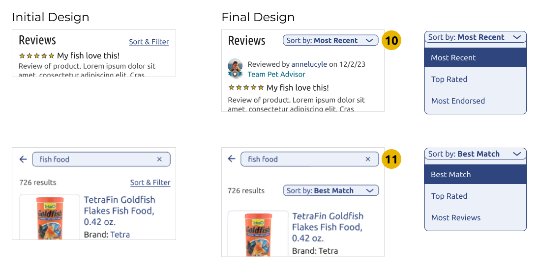
10 & 11 Several participants were curious about the sort options, and several wondered how the reviews (10) or search results (11) were sorted by default. I changed the simple “Sort & Filter” link to a drop-down that shows the current sort and included an expanded view of the other sort options.
OUTCOME & LESSONS
After testing and iteration, the MVP is an app that allows users to search for and review pet products without any unnecessary influence or biases.
The UI provides:
Clear messaging.
An intuitive user flow.
Ease of purchasing (through the Google Shopping link).
Visibility of non-monetary incentive to review products.
Lessons learned:
When I originally started this project, I had a different solution in mind. However, my research – in particular the user interviews – led me in a more interesting direction.
It can be difficult to tame our biases. It’s important to approach every project with an open mind.
View other case studies: